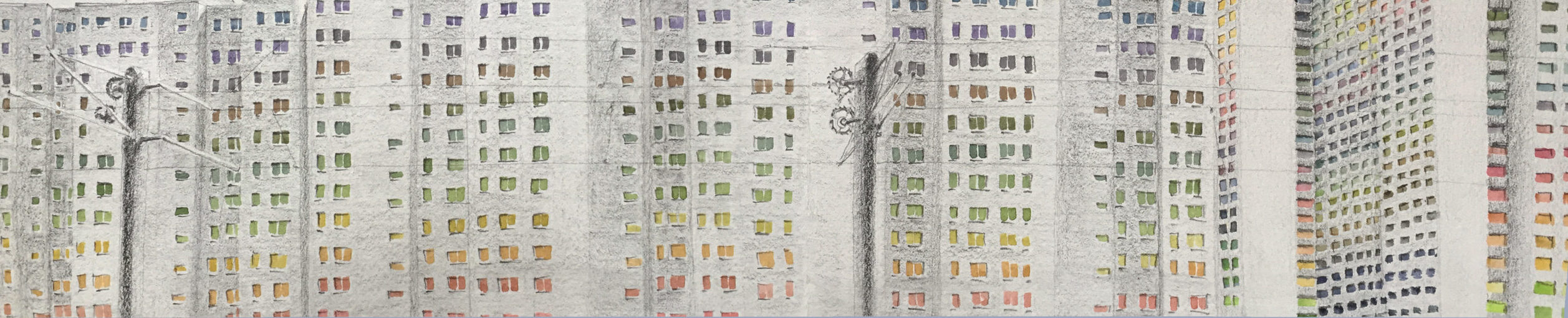
Allow me share a typical narrative about Soviet-era panel homes: one hears that these “house-boats”—nicknamed thusly because they stretched along entire city blocks—are gray, drab, and poorly-lit. A metonym for Soviet life, it seems, as some are quick to jump to judgements about uniform concrete slabs that seem to contain so much semiotic weight, yet could barely contain such weightless feelings as joy, sadness, surprise, ambition, jealousy, empathy. Feelings that we may not associate with the colour gray, but feelings that any person emplaced in a social setting may experience, albeit expressed within their cultural norms and political subjectivities. Why are such strong sentiments attributed to a formerly-beloved symbol of Soviet progress, which gave its citizens free apartments, quickly solved a major post-War housing shortage, and provided millions of families with foundational experiences at important stages of life, especially that housing was often allocated to newlyweds on the eve of starting a family?
My point is not to debate the relative merits of panel homes, but to consider the question by asking why gray has received such a bad rep. Unfinished concrete, or “béton brut,” is the colour gray. The use of the material inspired a style of architecture termed Brutalist, stemming from the finish of the material, rather than its unwitting ability to dole punishment upon city skylines.
Brutalist architecture was spurred on by the use of reinforced concrete by one of the most influential architects of modernist architecture, Le Corbusier. At the time, Le Corbusier’s contemporaries described his designs as “colour compositions without weight, and just as intangible as camouflaged ships” (Rasmussen 1959:94). Weightless, because of the properties of concrete as it interacted with its environment: if a “light gray, for example, bordered on a sky-blue […] then we would see nothing but several color planes without volume. The mass and weight of the box will have disappeared as if by magic” (Ibid., 94-96). As early as the 1920s, Le Corbusier discovered the potential of using thin concrete pillars, or pilotis, inside a building, rather than along its edge, thus letting the outer wall rest on cast concrete floors (Ibid., 96). This, in effect, gave the illusion that his houses “seemed to float on air” (Ibid.).
Because concrete was a relatively cheap and industrially-available building material, Le Corbusier idealized dwelling places as House-Machines: the “mass-production house, healthy (and morally so too) and beautiful” (Le Corbusier 1931:7). He called for a mass-production “state of mind,” which had not hitherto existed (Ibid., 229); beckoned for standardized, “artificial materials,” which are “pure manifestations of calculation” (Ibid., 232), instead of laborious natural materials popularized by Frank Lloyd Wright, which served the motley tastes of the upper classes. Dwellings, according to Le Corbusier, must incorporate “the principle of mass-production and of large-scale industrialization” (Ibid., 236), which will ensure “unity in detail” (Ibid., 265). In modern terms, Le Corbusier’s move to standardize construction could be interpreted as a move towards accessible and sustainable architecture.
After the Second World War, as massive pressure was being placed on city planners and architects to reconstruct ravaged cities using few available resources. Architects were called upon to design buildings for civic governments, which vied to regain citizen trust by promoting civic structures that turned outwards, appearing transparent and accessible to the public. The Post-war baby boom also signaled to massive shortages in residential housing. In this respect, Le Corbusier’s mission coalesced in the “Unité d’Habitation”—a Living Unit—first designed in Marseille, and then spread to other parts of France, and which was characterized by the infamous pilotis, a free façade, and long, wide corridors which were called “streets in the sky.” The idea whereby an interior is turned outwards is a dramatic reversal of Walter Benjamin’s city as seen by the flâneur, who, by virtue of inhabiting the street, as opposed to occupying a dwelling, makes the “street an interior” (421).
“For if flânerie can transform Paris into one great interior […then] the city can appear to someone walking through it to be without thresholds: a landscape in the round.” (Benjamin 1931: 422).
For Benjamin, the goal of turning the street inwards is the process of revolution itself: “only revolution creates an open space for the city. Fresh air doctrine of revolutions.” (Ibid. 422). The role of concrete was not to turn the street into a revolutionary space, but to construct a revolution in the “state of mind,” and perhaps nowhere was this idea more pertinent than amongst the Russian avant-garde in the heady days after the Russian Revolution of 1917.
In the early days of the Soviet Union, urban planning and architecture became politically ideologized as professions that ushered in a new revolutionary epoch: “to the avant-gardists of the 1920s everything seemed possible, and everything that already existed—as aging and needing change. Everyone agreed that a blank slate was needed, emptying space for new systems” (Ikonnikov, 1995: 7). Ideas about the construction and design of living space in the nascent Soviet Union were intimately connected to the goal of achieving communism. This set of beliefs came from the positivist, utopian belief that technological progress that made available new buildings materials, new building methods, and new architecture, would bring about new forms of living, working, and being in the world. Space, in that regard, “was a socializing project that undertook the formation of a new kind of person or moral subject. New ways of organizing the home, the workplace or the street would, it was claimed, produce new social relations that would, in turn, produce a new consciousness” (Crowley and Reid 2002:11). We are back to the idea of consciousness, then; in the way that planes, textures, lines, and colours, such as the colour gray, may influence our perception of our surroundings, our being in the world.
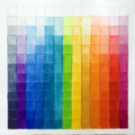
Between 1919 and 1922, almost exactly a century ago, while developing the preliminary course for future architects and designers at Bauhaus, Johannes Itten developed a model of visible colour based on its contrasting properties. The model combined both the physical properties of colour, whereby colours were organized according to the wavelengths they emit, as well as their subjective properties, such as colour temperature (Itten 1970: 12). Investigating the psychological perception of colour contrasts, Itten examined optical effects of neutral grays positioned against vibrant primary colours: “for any given color the eye simultaneously requires the complementary color”… which “occurs in the eye of the beholder, and is not objectively present. It cannot be photographed” (Itten 53). Depending on the subtle hue of gray, the eye fills it with colour details, making it appear as its complementary when positioned against a colourful background. When carefully considered, an earthy, natural tint in gray concrete produces an effect of simultaneous contrast, making the colour stand out if positioned against a light blue sky, while if tinted a cooler color, it may appear to float, like a comouflaged ship. Without descending into popular clichés about different shades of gray, and as housing projects are variously threatened with demolition, given new façades, or allowed to fall into disrepair, the long-winded point I wish to make here, is that our feelings aside, gray matters.
Literature cited
Benjamin, Walter
1999[1940] “Convolutes M: The Flâneur.” In The Arcades Project. Rolf Tiedemann, ed. Translated by Howard Eiland and Kevin McLaughlin. Pp. 416-455. Cambridge: Belknap Press of Harvard University Press.
“Russia outside Russia”: Transnational Mobility, Objects of Migration, and Discourses on the Locus of Culture amongst Educated Russian Migrants in Paris, Berlin, and New York
Crowley, David and Susan E. Reid
2002 “Socialist Spaces: Sites of Everyday Life in the Eastern Bloc.” In Sites of Everyday Life in the Eastern Bloc. David Crowley and Susan E. Reid, eds. Pp. 1-22. Oxford: Berg.
Le Corbusier
1986 [1931] Towards a New Architecture. Translated from French by Frederick Etchells. New York: Dover Publications.
Itten, Johannes
1970 The Elements of Color. Originally published as Kunst der Farbe: Studienausgabe. Edited by Faber Birren. Translated by Ernst van Hagen. New York: Van Nostrand Reinhold Company.
Rasmussen, Steen Eiler.
1959 “Experiencing architecture.” Cambridge: The M.I.T. Press.
Reid, Susan E.
“Khrushchev Modern: Agency and Modernization in the Soviet Home.”
Read more posts:
- Приглашение на антропологический/художественный проект
- On Race Cars and Enlightenment

- Artists Books

- Hand Gestures

- Red Square